


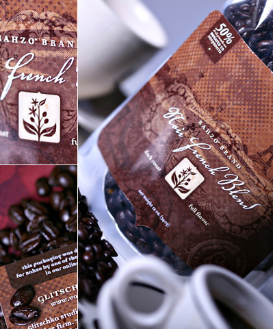
Brewing Design
Creation of a coffee label with Von R. Glitschka.
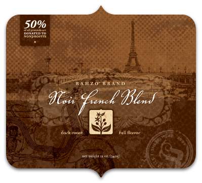
I had shown this label to twitter users a while back after I got shipped some printed samples and was asked if I'd deconstruct how I went about creating it.
Well that is what this blog post is all about. So grab a cup of coffee and enjoy the post.
1. Source Photo
Because I named the roast "Noir French Blend" it goes without saying it needs to have a French flair to the approach. I sourced out this picture which has the Eiffel Tower in the background.
I also picked this image because the contrast was perfect for how I planned on using it too.
Compositing images via Photoshop.
2. Distorting Reality
I wanted the the Eiffel Tower to be a focal point in my composition so if reality doesn't work you do what every fashion magazine does and manipulate reality so it looks better than real.
Converting photo to a halftone.
3. Halftone FX
I converted the photo to a halftone. In a nutshell: Convert color photo to greyscale, convert to halftone by going to the menu image/mode/bitmap. From there you'll have to experiment in order to determine what size of halftone works best for you, it isn't a one size fits all process. Once you have the size nailed down you have to convert back from bitmap to greyscale then copy/paste it back into your PSD file.
If you're still scratching your head after reading the above try this link it might help you? Or my big dot tutorial might also explain this process better?
Halftoned photo integrated into layout.
4. Halftone Integrated
I nest the halftoned photo into my over all layout. Mind you this is screen res so it doesn't do the halftone justice. Make sure to view the larger image at the end of this post to see how the halftones enhance the look and feel of the design.
European Beauty.
5. Romance
I wanted drama in my design. It's Paris so it needed some beautiful romance so I sourced out this photo. Her eyes were captivating and that was what I was after.
Romantic dot gain.
- - - - -
Click Here to read the full article and all 15 steps!
 2 Comments
Reader Comments (2)
Whoa!!! You really made that label?? Niiiiiiiiiice. :)
No, I didn't make it, I was just posting an article by Von R. Glitschka :) But, yes, i agree it is very nice!