Search the Blog
Network With ReelCast


Films For The Family

Inspirational Web Videos

Film Festival

Blog Archives
Admin Login

Entries in Graphic Design (9)

9:00AM

Apple - Mac Pro

"A sneak peek at the future of the pro desktop."

When we began work on the next Mac Pro, we considered every element that defines a pro computer — graphics, storage, expansion, processing power, and memory. And we challenged ourselves to find the best, most forward-looking way possible to engineer each one of them. When we put it all together, the result was something entirely new. Something radically different from anything before it. Something that provides an extremely powerful argument against the status quo. Here’s a sneak peek at what’s next for the pro computer.

Even if you aren't interested in the Mac Pro, it's worth visiting the website (and scroll down) to experience the creative and amazing sneak peek they've put together!

Click Here to read more!

8:09AM

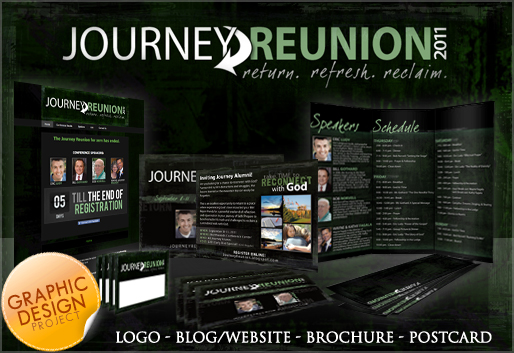
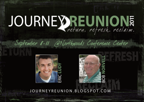
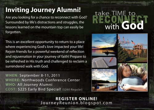
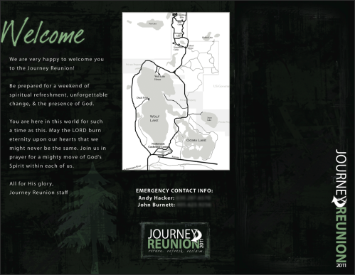
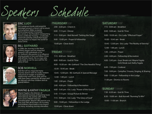
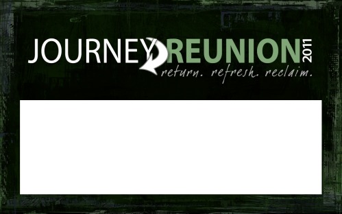
Journey Reunion Graphic Design

My family and I were recently involved in coordinating "Journey Reunion 2011" - more info here - as a result I was able to do the design work for the promotional elements as well as the conference materials!

Logo Design


Vertical Logo


Email Campaign Graphic


Email Campaign Graphic


Email Campaign Graphic


Postcard FRONT


Postcard BACK


Conference Brochure BACK

 Conference Brochure INSIDE


Nametag


You can also view the website here: JourneyReunion.blogspot.com

2:43PM

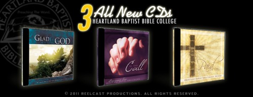
Heartland CDs 2011

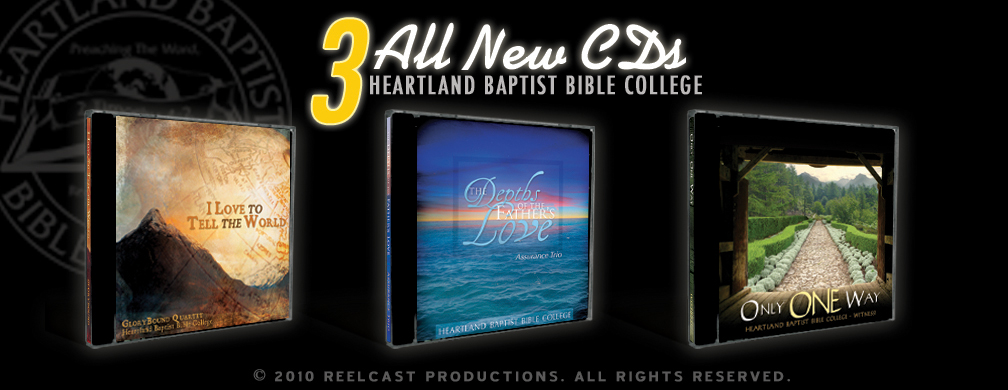
Film news is a little slow right now so I thought I would post about one of my recent graphic design projects. These are the CD covers I did this year for Heartland Baptist Bible College.

8:00AM

Learning the Basics - Pt. 3

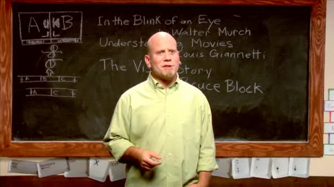
Several years ago Digital Juice produced several training series for the web called DJTV. It covered topics ranging from Audio, Tech Info, and Filmmaking Basics. One of the shows I enjoyed the most was "Cutting Class" by Chris Gates.

Cutting Class

More often than not, the edits in your sequences need to seamlessly flow, and not distract from the big picture. In this episode, Chris "Ace" Gates, looks at the decision making process and covers some basic training for camouflaging your cuts.

Topics range from Color Correction, Scene Transitions, ADR, Blending Modes,Tips for Text, Green Screen, and more! Chris "Ace" Gates shares some simple but effective editing tips and techniques for utilizing mattes and masks to build multi-layered composites.

Here is a link to watch all the Cutting Class videos, be sure to start with the first video on page 1, for some reason it has all the episodes listed with the last one first.

WATCH CUTTING CLASS

8:01AM

Heartland CDs 2010

These are some CDs cases I designed this year for one my annual clients, Heartland Baptist Bible College.

You can listen to previews from the CDs here:
- I Love to Tell The World (Men's Quartet)
- The Depths of the Father's Love (Ladies Trio)
- Only One Way (Ensemble)

4:12PM

Freedom Film Distributors

An update on what I've been working on.

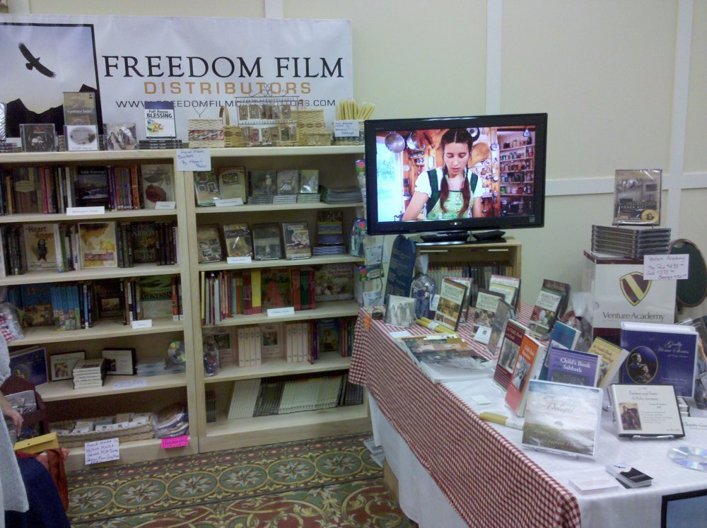
This is a company that I've been doing quite a bit of graphic design work for this year.

They recently posted this picture on their blog, you can see the banner there in the background and the business cards on the table.

You can see a few more pictures on their blog - blog.freedomfilmdistributors.com

11:56AM

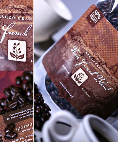
Brewing Design

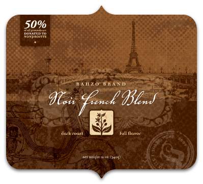
Creation of a coffee label with Von R. Glitschka.

I had shown this label to twitter users a while back after I got shipped some printed samples and was asked if I'd deconstruct how I went about creating it.

Well that is what this blog post is all about. So grab a cup of coffee and enjoy the post.

1. Source Photo
Because I named the roast "Noir French Blend" it goes without saying it needs to have a French flair to the approach. I sourced out this picture which has the Eiffel Tower in the background.

I also picked this image because the contrast was perfect for how I planned on using it too.


Compositing images via Photoshop.

2. Distorting Reality
I wanted the the Eiffel Tower to be a focal point in my composition so if reality doesn't work you do what every fashion magazine does and manipulate reality so it looks better than real.


Converting photo to a halftone.

3. Halftone FX
I converted the photo to a halftone. In a nutshell: Convert color photo to greyscale, convert to halftone by going to the menu image/mode/bitmap. From there you'll have to experiment in order to determine what size of halftone works best for you, it isn't a one size fits all process. Once you have the size nailed down you have to convert back from bitmap to greyscale then copy/paste it back into your PSD file.

If you're still scratching your head after reading the above try this link it might help you? Or my big dot tutorial might also explain this process better?


Halftoned photo integrated into layout.

4. Halftone Integrated
I nest the halftoned photo into my over all layout. Mind you this is screen res so it doesn't do the halftone justice. Make sure to view the larger image at the end of this post to see how the halftones enhance the look and feel of the design.


European Beauty.

5. Romance
I wanted drama in my design. It's Paris so it needed some beautiful romance so I sourced out this photo. Her eyes were captivating and that was what I was after.


Romantic dot gain.

- - - - -

Click Here to read the full article and all 15 steps!

4:18PM

Heartland Graphic Design

I've been doing the CD graphic design work for Heartland Baptist Bible College since 2007. They have three singing groups and each year they produce a CD through Heartland Studios.

Each design package includes a 4 page insert (front, back and 2 page inside), CD label, tray (cd case back) and an 11x17 poster. Click on the pictures to see a larger version. Enjoy!


Witness! (ensemble)


GloryBound (men's quartet)


Assurance (ladies trio)


1:02PM

Got it covered

I just finished some design work for Heartland Baptist Bible College, and I thought I would pass along some of the graphic design. These CD case packages consisted of a 2 sided insert (front and inside), the back of the tray card and the CD label. And NO, the watermark is not on the client's graphics :P

ALUMNI '07 CD

1st idea for the front (it was not quite what they were looking for)


2nd idea (FINISHED PRODUCT)

Front


Tray Card


FAVORITES CD

(FINISHED PRODUCT)

Front

Tray Card


CD

If anyone has tips for me to improve I am wide open and listening :)