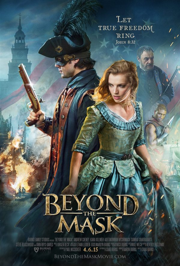
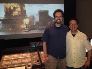
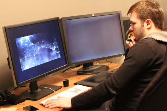
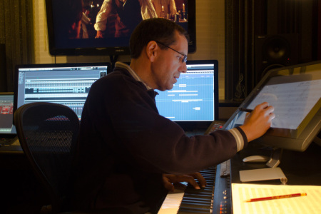
One of the key players in putting the finishing touches on Beyond the Mask was senior colorist Keith Roush. A few weeks ago, Aaron and Chad flew out to LA to work at Keith’s studio, Roush Media, on the color grading process. It was fun talking to Aaron, Chad, and Keith about their time working together and getting a chance to understand what it was like developing the movie’s final, defining look.

The color in the final edit looks stunning. Here Beyond the Mask’s heroine
Charlotte Holloway enters a Philadelphia shop.
Because color grading is an aspect of filmmaking that gets little attention, I’ll let Keith introduce you to the process. “We refer to our job as color grading. We don’t like to use the term color correction, because that title denotes that you are correcting for an error, so the DP (director of photography) doesn’t like that. What we do is color balancing, color enhancement, and look development. It’s really about setting the mood with warm, happy tones or dark, edgy tones to give the audience visual cues. We are shaping the lighting to enhance the drama of what’s going on in the scene.”
Chad and Aaron were excited about the opportunity to work with Keith. “Keith has a good eye for color,” Chad says. “One of the things that he did really well was understanding how much work to do in each particular scene. It can be easy to get lost in the weeds, twiddling the knobs, and do too much detail work in one particular spot, making the film look patchy. But Keith did a lot of great work keeping it uniform, and he didn’t push any of the details too far.” He has an impressive resume, and as a believer, he has a heart for faith-based films. Some of Roush Media’s most recent projects include the titles God’s Not Dead and Mom’s Night Out.

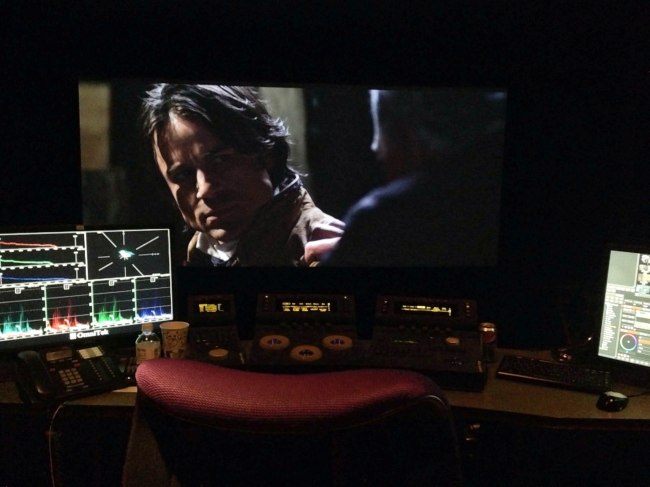
Roush Media’s equipment is state of the art.
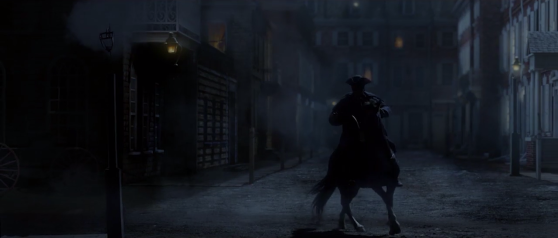
In contrast to some of the more traditional, modern films, however, the job of color grading for Beyond the Mask was a bit more difficult. The details that make an action adventure film exciting, like night scenes, explosions, firelight, and VFX sequences take a lot of skill to properly balance the color. Keith agreed that these elements were challenging, but added that “They can be fun at the same time, especially the visual effects, because we are often doing twenty layers of the various controls on every part of the frame on those shots in order to really shape the lighting and make it as realistic as possible. In the scene with the explosion in the forest, we’re doing a number of color tricks in order to bring out the warm, red fire and have that color contrast against the cold blue moonlit woods. But those are the very beautiful, strongly lit, creatively colored scenes in Beyond the Mask that give the imagery depth and make it stunning to look at.”
One of Keith’s favorite sequences in the film is Will’s dream. Keith elaborates, “Chad and Aaron allowed me to be creative and push the bounds of what was possible with this scene. We created a very stylized look where we’re heavily washed in blue. Then we isolated the red and warm tones to make them pop, which created a unique and beautiful color contrast. It’s a monochromatic blue with very warm tones laid on top of it in a very stark, gloomy way. Then we also blurred the highlights, making it very soft and almost ethereal. It gives you a sense that this is in the mind’s eye. That’s an example of how colors really set the tone for what you’re looking at.”
In discussing their time working together on the color grade, Keith, Chad, and Aaron all commented on the moment they saw the film on the theater screen for the first time. The experience had an impact that they were not expecting. Chad says, “We had been working on this film for almost three years, but had never seen it on a big screen. The details, the acting, the visual effects – everything read better than it had on a smaller screen, and there was something quite charming about seeing the movie on the big screen.” Seeing their work in the theater, with the images of Beyond the Mask finally looking their best was a fitting finale to the process. Keith concurs, about the experience, “When I first watched Beyond the Mask on the little screen on my iPad, I was completely blown away by what they accomplished, so I knew that once we took that to the big screen, and started to do what we do best with the image and color, it was going to look like a Blockbuster, which it ultimately did.”
- - - - - -
(Article Source)




 Post a Comment