Search the Blog
Network With ReelCast


Films For The Family

Inspirational Web Videos

Film Festival

Blog Archives
Admin Login

Entries in Color Correction (8)

8:00AM

Christian Worldview Film Festival 2015

The full list of 2015 Official Selections is now online!
Guild & Festival // March 10-14

Here are the films I helped with that will be showing this year.

- Polycarp (Camera, Editor, Colorist)
- Bound (Consultant)
- Roses (On-set Editor)
- Wanted (Editor, Colorist)
- Firefly (Consultant)
- Awakened to Truth (Post Production Director)
- Overcoming Opposition (Post Production Director)
- The Egg Project (Post Production Director)
- Who We Are (Director of Photography)
- Set Free (Consultant)

View the full list here!

Also, if you haven't purchased your tickets to the Guild & Festival, be sure to use discount code JOHNCLAYBURNETT to get $25 OFF!

Purchase tickets here!


8:00AM

Beyond the Mask - Color Grading

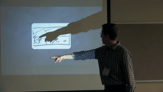
One of the key players in putting the finishing touches on Beyond the Mask was senior colorist Keith Roush. A few weeks ago, Aaron and Chad flew out to LA to work at Keith’s studio, Roush Media, on the color grading process. It was fun talking to Aaron, Chad, and Keith about their time working together and getting a chance to understand what it was like developing the movie’s final, defining look.

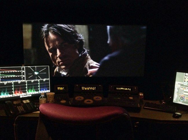
The color in the final edit looks stunning. Here Beyond the Mask’s heroine
Charlotte Holloway enters a Philadelphia shop.

Because color grading is an aspect of filmmaking that gets little attention, I’ll let Keith introduce you to the process.  “We refer to our job as color grading. We don’t like to use the term color correction, because that title denotes that you are correcting for an error, so the DP (director of photography) doesn’t like that. What we do is color balancing, color enhancement, and look development. It’s really about setting the mood with warm, happy tones or dark, edgy tones to give the audience visual cues. We are shaping the lighting to enhance the drama of what’s going on in the scene.”

Chad and Aaron were excited about the opportunity to work with Keith. “Keith has a good eye for color,” Chad says. “One of the things that he did really well was understanding how much work to do in each particular scene. It can be easy to get lost in the weeds, twiddling the knobs, and do too much detail work in one particular spot, making the film look patchy. But Keith did a lot of great work keeping it uniform, and he didn’t push any of the details too far.” He has an impressive resume, and as a believer, he has a heart for faith-based films. Some of Roush Media’s most recent projects include the titles God’s Not Dead and Mom’s Night Out.

Image

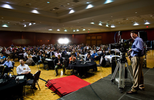
Roush Media’s equipment is state of the art.

In contrast to some of the more traditional, modern films, however, the job of color grading for Beyond the Mask was a bit more difficult. The details that make an action adventure film exciting, like night scenes, explosions, firelight, and VFX sequences take a lot of skill to properly balance the color. Keith agreed that these elements were challenging, but added that “They can be fun at the same time, especially the visual effects, because we are often doing twenty layers of the various controls on every part of the frame on those shots in order to really shape the lighting and make it as realistic as possible. In the scene with the explosion in the forest, we’re doing a number of color tricks in order to bring out the warm, red fire and have that color contrast against the cold blue moonlit woods. But those are the very beautiful, strongly lit, creatively colored scenes in Beyond the Mask that give the imagery depth and make it stunning to look at.”

One of Keith’s favorite sequences in the film is Will’s dream. Keith elaborates, “Chad and Aaron allowed me to be creative and push the bounds of what was possible with this scene. We created a very stylized look where we’re heavily washed in blue. Then we isolated the red and warm tones to make them pop, which created a unique and beautiful color contrast. It’s a monochromatic blue with very warm tones laid on top of it in a very stark, gloomy way. Then we also blurred the highlights, making it very soft and almost ethereal. It gives you a sense that this is in the mind’s eye. That’s an example of how colors really set the tone for what you’re looking at.”

In discussing their time working together on the color grade, Keith, Chad, and Aaron all commented on the moment they saw the film on the theater screen for the first time. The experience had an impact that they were not expecting. Chad says, “We had been working on this film for almost three years, but had never seen it on a big screen. The details, the acting, the visual effects – everything read better than it had on a smaller screen, and there was something quite charming about seeing the movie on the big screen.” Seeing their work in the theater, with the images of Beyond the Mask finally looking their best was a fitting finale to the process. Keith concurs, about the experience, “When I first watched Beyond the Mask on the little screen on my iPad, I was completely blown away by what they accomplished, so I knew that once we took that to the big screen, and started to do what we do best with the image and color, it was going to look like a Blockbuster, which it ultimately did.”
- - - - - -
(Article Source)

2:55PM

NAB 2013 - Technicolor

Discover a new line of powerful Hollywood color correction and grading tools from the worldwide leader in color. With Color Assist, create stunning video faster and easier than ever before.

Compatible with Final Cut Pro X, and Adobe Premiere CS5.5 & CS6!

Save $20 dollars on Technicolor Color Assist! This offer is good now, through April 11. Just visit the link below and use discount code: NABSHOW20 when you checkout.

Technicolor Website

8:00AM

NEW ReelCast Demo & Color Reels

3:16PM

"The Eleventh Coin" - FA 2012

I was blessed with the opportunity to be one of the leading teachers at the 2012 Filmmakers Academy in Austin, TX. FA is a week long film camp that gives students a hands-on opportunity to walk through the full process of creating a short film. You can view the short film at the end of this post.

This year they opted to produce a silent film due to time constraints and location logistics.

We had two units, Unit A filming the Bible-time side of the storyline, and Unit B (my group) produced the modern-day side of the film.

 Just remember, this is a project made primarily by students in one week.

1:50PM

Early-Bird Registration Ends July 1st!

Early Bird registration for the Vision Forum Festival and Academy ends on July 1st! If you are considering attending this year, I'd recommend signing up early because the price goes up an extra $200 for regular admission. Sign up here!

Some pics from last year...

6:54PM

FILM PIPELINE - Part 3

Post Production

"At last, we get to the end of the film pipeline.  Postproduction is everything that comes after shooting has finished."

Topics:
-
Acquisition
-
Visual Effects and Effects Editing
-
Editing, Sound (Editing, Design, Foley, Dialog Editing and A.D.R.) and Music (Scoring)
- Job Descriptions for Post-Prod Jobs
-
Sound Mix
-
Color Grading / Timing and “D.I.“
-
Print It!
- - - - -
By Stephan Vladimir Bugaj

- All the "Film Pipeline" links can now be found in the Basics drop-down menu in the header bar.

12:31PM

Color Correction & Memory Colors

"Memory colors are colors that are, in the minds of your audience, inseparable from certain common objects or events. For example, the sky is so associated with blue that you might feel that you see those two words together as often as you see them individually. The same goes for green and grass.

The most basic idea of color correcting is that you are making colors correct, which is to say that you are making objects on the screen appear to be the colors that we know them to be.

The funny thing about this seemingly simple task is that it can be quite difficult. And it’s difficult for exactly the reason that it’s important.

Here’s a very simple example. I bought some espresso beans today from my favorite local roaster, Blue Bottle coffee. As I was transferring them to an air-tight container, my 7D was right there, so I popped off a quick 720p60 shot of the process—because who doesn’t like seeing coffee beans tumble in slow motion? (see the video here)

When looking at the footage on my computer, I noticed a funny thing. The beans, which in life have a vivid, sumptuous brown tone, appeared gray-black on my screen. I almost didn’t notice, because I know they are brown, but on close inspection it was clear that I had been fooled by my brain into seeing what I knew rather than what was actually there. The cool color temperature of the indirect sun lighting the shot was reflecting off the beans and cooling their color down to near neutral.

There’s nothing unnatural or wrong about this, except that the audience for my espresso epic doesn’t know about the cool light source outside of the frame. They don’t even necessarily know what the falling objects are. I have to communicate that visually, so I need to preserve—or, in this case, recreate—the memory color of perfectly roasted coffee beans.

Here’s the shot with a Colorista Power Mask for just the beans:

And here’s that same shot with an overall look applied after the bean color fix.

To really see the importance of the local correction, look at the shot with the look, but without the bean fix:

Not only do the beans look more appetizing with the fix, they also survive the subsequent look adjustment better. In fact, since the look cools down the shot a bit, the warm color of the beans stands out all the more. Without the bean fix, the look utterly clobbers the brown beans. As a bonus, in the corrected version, the metal canister and the corner of the grinder on the right take on a steely blue color, better matching the viewer’s idea of what color metal should be.

If you pick your memory colors for a scene, and preserve and enhance them through your look, you’ll wind up with shots that pop without looking clobbered by a heavy-handed “preset” look." ~Stu Maschwitz

- - - - -

If this information was helpful, I recommend reading the full article on the ProLost Blog here.