Search the Blog
Network With ReelCast


Films For The Family

Inspirational Web Videos

Film Festival

Blog Archives
Admin Login

Entries in Tips and Techniques (22)

8:00AM

Helpful Ways to Get a Grip on Lighting

By Bobby Marko | July 31, 2014
(Article Source)

I spent the 1st half of this year releasing two films, a feature length documentary and a short film narrative (Becoming Fools and Fruitcake respectively). Through this process I've attended screenings and festivals of our own films and for others. I've also sat through several Q&A's with independent filmmakers and although I love hearing how other creatives move through the process of producing their work I sometimes get increasingly frustrated with the fact that camera gear takes such a center stage while lighting, composition, sound design and production design take a distant back seat.

As important as camera and lens choice is for your production lighting, audio and composition are equally as important. I've seen quite a few films shot on RED, Alexa and high end Canon and Sony cameras that looked awful. They should have saved the money they spent on those high end cameras and lenses and invested in lighting and shot on a dslr, it would have at least looked better.

Many times in the moment of my irritation I thought about firing off a social media post to make a quick statement. But I thought it best served to compile my thoughts and turn these points into teachable moments. I'll try not to make these posts long, there will be a few of them. But I want to make these tips easily digestible and things you can put into practice immediately.

Lighting Tips for Cinematographers

Part I: Foreground and Background Exposure

A common mistake I see with independent and young Filmmakers is not knowing how to light their scenes for foreground and background. Often they rely on setting a low aperture from their lens to create depth. However, properly setting your exposure for your foreground (or subject) and background will create the same affect and give you more options with your camera.

The general rule of thumb is to set your key light one step higher than your background. Of course there are some variations to this rule depending on style and genre. But I want to burn that rule into your brain, my subject must be lit one stop higher than my background. Say that to yourself until it's the first thing that comes to mind when your gaffer asks you "how do you want to light this?"

Now, how do you do this? Very simple, get yourself a light meter (I don't care if your gaffer has one already, every cinematographer should have one in his or her dity bag). Even if you have an app such as Cine Meter, it's still a tool to aid you. Which ever you have, learn to use it (I'm not going to go into depth on how to use a light meter, there are plenty of YouTube and blog posts covering that subject) and then once you have a simple lighting rig set up meter your subject. Let's say for example you get a reading at 4.0. Remember that and then move to your background. Find a flat area that faces your camera lens and meter that area. You should get a reading of 2.8. If not then adjust your lighting respective to your reading. If the background reads 3.2 then your a half stop too high. Consider a half scrim or pull your lighting back (or dim a half step if you have that ability). If you're reading is 1.4 for the background then you must increase the power. Sometimes you have to adjust your key light in order to get the proper setting but no matter which method you have to employ, once you have this set, you will have a proper foundation to start with lighting your scene. Now, let's look at some examples.  


Shawshank Redemption (1994) Roger Deakins - DP

Here is a clear example. We have the subject that is not too far from the bookcase behind him in the background but notice how Roger Deakins (DP) lights the subject at least one stop above the background. Had he lit the background as much as the subject, even keeping the same depth of field, the image would have been flat and the focus for the audience would not have remained on the subject. 

Helpful Ways for Cinematographers to Get a Grip on Lighting
We Are What We Are (2013) Ryan Samul - DP

Here's another example where Ryan Samul uses the same principle. His subject is lit at least 1 stop above the background, even though the texture is great, it's not the focus of the scene so he chooses to keep the background dimly lit. Now, as I mentioned before employing this method is a start. Sometimes you want your background to play a role in the scene as it conveys an importance in relationship to the foreground and.or subject. So let's look at some examples as to when this rule can be broken.

Helpful Ways for Cinematographers to Get a Grip on Lighting
The Big Lebowski (1998) Roger Deakins - DP

Here you see the background of the grocery store obviously lit much higher than the subject. And if you also notice the angle in which Deakins uses the store shelves, starting in the foreground and moving towards the background. This is to show the deep philosophical nature of  "the Dude" in the opening scene. It's also to establish the environment in where he is. No one is around, he is isolated. You can assume that it's the middle of the night when most people are not at grocery stores. So there's a ton of information you can gather from this one shot and a reason why sometimes you want to break the one stop rule when lighting foreground and backgrounds. But at least you can see the lighting is not even so there is still depth to the scene.

Helpful Ways for Cinematographers to Get a Grip on Lighting
Book of Eli (2010) Don Burgess - DP

Now here is a shot in which Don Burgess decides to blend the characters in with the background. Both the subjects and background are nearly in focus and lit almost the same. Why? Many times you want to submerse the viewer into the world in which your characters are living and here is a good example of that. This method of even lighting allows the audience to get a sense of the environment in which the characters are currently in. But notice there is still a lot of light and dark, between the object, even on the characters who are lit from only one direction. Burgess still employed depth but just from a side to side and not in Z space.

Like with most anything creative, there are rules to break and the "one stop" rule with lighting is certainly no different. But learn it first and then use the creative process to know when and how to break it.
- - - - - -
(Article Source)

8:00AM

Facebook Timeline for Business

Don’t make these 4 Facebook Timeline Page mistakes:

- - - - -
Article Written By: T&S Web Design

No Facebook Mistakes

On February 29th, Facebook rolled out Timeline for Pages. And boy, are there a lot of changes. And you only have until March 30th to figure them all out, because that’s when they’re forcing everyone to switch over. How can everyone get it all right?

You don’t have to learn it all, you just have to learn what not to do when converting your page. Let’s take a look at four mistakes you need to avoid.

Read all the way to the bottom to see how you can win a professional, custom-designed Cover Photo and Profile Picture for your page.

1. Don’t convert without a Cover Photo

Your Cover Photo, or lack thereof, is now the first thing that visitors to your page will see. Previously, you could have set a default landing tab for visitors to go to first. Although custom tabs are still there (and wider than before), your Timeline is now the default landing tab, and there’s currently no way to change that.

Your Cover Photo should be 851 pixels wide and 315 pixels tall. If you upload anything smaller, it will be stretched to that larger size. If you upload anything larger, Facebook will let you reposition the image, changing what portion of the image is shown.

While you can just upload any large image, try to be creative with your Facebook Cover Photo!

2. Don’t ignore your messages

By default, your page will now have Messages turned on. This means that instead of giving out an email address, people can send you a message directly from your page. The message button is below your Cover Photo on the right, and the messages themselves appear on the top right of your Admin Panel at the top of your page.

Of course, you can turn this off. To do so, click the Manage drop-down menu at the top right of your Admin Panel, then select Edit Page.

You should then have Manage Permissions highlighted in the left menu. On the right, one of the checkboxes is for Messages. To remove the option for Messages, simply uncheck the box and click Save Changes.

Note: In our tests, no admins received email notifications of the messages, and we were unable to find a setting to turn that on. Although this could change, if you don’t check your Facebook page often, I suggest turning messages off.

Also, incidentally, pages can’t currently message other pages.

3. Don’t forget to customize your application shortcuts

Previously, applications and custom pages were linked to in the left column with a simple list of pages with a small icon next to them. Now, they’re a series of thumbnails on the bottom right of your Cover Photo, right under the spot for the Message button. And you’re now limited to a maximum of 12 apps whose thumbnails you can display.

The good news is that you can rearrange them, customize their thumbnails and customize their names. And to make your page stand out, you should definitely customize everything.

The first thumbnail is your page’s photos, and you can’t move that one from the first spot. However, all the rest of them can be re-ordered and the photos can be changed. And those are both important, especially considering that you only have three customizable spots visible before visitors click the down arrow on the right!

Let’s rearrange them first.

  1. Click the drop down arrow to the right of your four thumbnails. (At that point, all your thumbnails should appear.)
  2. Hover over one of them, and a little pencil icon should appear in the top right of the thumbnail.
  3. Click on that to reveal a drop-down menu with a list of your applications at the top.
  4. Simply click on the name of another application to swap their positions.

Now let’s change the thumbnail for one of the applications. Our first three steps will be the same.

  1. Click the drop down arrow to the right of your four thumbnails. (At that point, all your thumbnails should appear.)
  2. Hover over one of them, and a little pencil icon should appear in the top right of the thumbnail.
  3. Click on that to reveal the drop-down menu.
  4. Then click on the Edit Settings link, and another window will pop up.
  5. Next to “Custom Tab Image,” click Change. Another window will pop up (again).
  6. To the right of the image, click Change.
  7. Upload your image.
  8. Close the window.
  9. Click Okay to close the other window.

Finally, we’ll change the name of an application shortcut. This time, our first four steps will be the same as changing the thumbnail.

  1. Click the drop down arrow to the right of your four thumbnails. (At that point, all your thumbnails should appear.)
  2. Hover over one of them, and a little pencil icon should appear in the top right of the thumbnail.
  3. Click on that to reveal the drop-down menu.
  4. Then click on the Edit Settings link, and another window will pop up.
  5. Next to Custom Tab Name, type in the new name you want it to have.
  6. Click Save.
  7. Click Okay.

Make sure you customize those three elements of your shortcut, and you’ll stand out from the crowd.

4. Don’t forget to change how your important posts appear in your timeline

You have some options to modify how your post appear down in your page’s actual timeline. When you over over an individual post, a star icon and pencil icon appear on the top right.

Click the star icon will make the post stretch across the entire timeline. And if you have images in your post, highlighting it makes the images much bigger.

If you click on the pencil icon, you’ll have a few options, including Pin to Top and Change Date. Clicking Change Date lets you change the date of the post. Big surprise, right?

Pin to top of Facebook Pages

Clicking on Pin to Top makes the post the first one in the top right, just under the box that lets you write a new post. Only one post can be pinned to the top at a time, though. And when you pin it to the top, a little bookmark icon appears on the top right that everyone who views your page will see.

And that’s not all!

Those are the four biggest Facebook Page Timeline mistakes that page admins should be aware of. Of course, there are tons of other features and changes as well. Without going into major depth, here’s a few of them:

  • Custom tabs went from 520 pixels wide to 810 pixels wide (and designers everywhere rejoiced).
  • If you’re set to use your Page as yourself by default, you can now switch to being your Page under the Manage drop down menu in the top right of your Admin Panel.
  • There’s now an Activity Log of all the activity on your page. It’s also on the Manage drop down menu.
  • When using your Page as your Page (but not when using it as yourself), you can add Milestones, with a featured image, to your timeline. It will ask you to first add the year your business or brand began, but then you can add any milestone.
  • On the top right of the timeline area, you’ll see your friends that like the page, a post by a friend that mentioned the page in their status, recent posts by others on the page’s timeline, and a list of the pages that page likes.
  • By default, only “highlights” show up in the timeline. Whatever that means. To change it, click the extremely light drop down just below your photos thumbnail. You can limit it to posts by the page, by everyone but the page, or by friends.

And, of course, there are lots of other even more minor changes. When you get a chance, get in there and play around with everything.

- - - - -
Article Written By: T&S Web Design

8:00AM

What to Look for in a Video-style Tripod

Scott and Rich discuss video style tripods (which are helpful for both Timelapse and DSLR video). Many traditional photography shooters are switching styles and trying them out too as they are easy to quickly recompose a shot then lock it down solid for HDR too. Learn about Miller tripods and what features matter (and which are overkill).

- - - - -
Source Article

7:04PM

50% Off Ripple Training!

50% Off Sale  - One Week Only!

Ripple Training has become the premiere training destination site for users of Apple's Final Cut Pro & Motion. They also have training for all apps in the Final Cut Suite. I think they even have training for some Adobe applications.

Take advantage of 50% savings on any item on our site. Sale ends Sunday May 22.  
 
www.rippletraining.com

8:00AM

FCP Tip: Window Layouts

Article by Walter Biscardi

Well the honest truth is, there is no ONE layout that is the most efficient for FCP.  In my case, I use up to a dozen different interfaces depending on the task at hand.  I’ll literally switch layouts over the course of the day depending on what I’m doing.

Here’s a few examples to get you guys started thinking on using your layouts more efficiently…..

Now first off, I’m on a 27″ iMac for these images since it’s useless to try to grab screen grabs of dual monitors, but you get the gist.  So here’s your Standard View.  Not bad but gives you too much room for everything.

Now here’s what I call Full Screen Timeline.  Typically the Viewer / Canvas and Browser is on my left screen and the entire right screen is only the timeline.  Notice how large I can make the timeline and how easy it is to go in and tweak edit points, transitions, audio fades, etc…..  I use this layout a lot after I’ve done the rough cut and I’m starting to massage the timeline.  I also use this for all final mastering working before it goes to tape or digital file.

Now here’s my Color Correction layout. I have my three primary scopes up and at the ready, Waveform, Vectorscope and Parade.  I have a smaller timeline since I’m only working with one shot at a time, so I don’t need to see the entire timeline, just the shot I’m working with.  The Canvas is extremely tiny because I don’t care about that, I’m looking at my Flanders Scientific reference monitor.  The real key to this layout is the elongated Viewer that fills the screen vertically.  Notice how I have access to every single control of the FCP 3 Way CC tool without even having to scroll?  It’s the same with Colorista.  When I’m color correcting what I NEED to see are the scopes and CC tools.   So by laying out the windows this way, it makes for a very efficient color correction session if I’m doing the work in FCP.
This is my Rough Cut layout. Maximum space for the bins and thumbnails where I want them.  Tiny timeline because for the most part I’m just straight cutting and putting in dissolves with little or no attention to audio.   I use this layout so I can see as much of my raw footage at a time and quick drop shots into the timeline for flow and timing.  Typically my viewer / canvas are on the opposite screen since I’m not really referring to them much at this point, I’m looking off at my FSI monitor.

And finally here’s my Audio Mixing layout. It’s a variant on Apple’s own layout.  Now on my dual monitor layout, the timeline is actually full screen with the audio meters on the other screen.  Again, makes it easier to control the audio tracks by enlarging them in a full screen layout.  I make the viewer wider to give me more control up there if I need to do some fine tuning of fades and pans.

So there’s a few of my layouts, hope that’s helpful to some of you.  Stop trying to find that “one perfectly efficient window layout” because it doesn’t exist.  Set yourself up multiple layouts and simply switch between them as you’re working.
- - - - -
Source Article
Written by Walter Biscardi
8:00AM

FCP Tip: A Better Text Tool

The basic Text Tool in Final Cut Pro is very weak so why limit yourself to that one tool?

In this quick Final Cut Pro tip, Walter Biscardi, Jr shows you where to find a much better font tool.

- - - - -
Source Article
by Walter Biscardi

8:00AM

Learning the Basics - Pt. 3

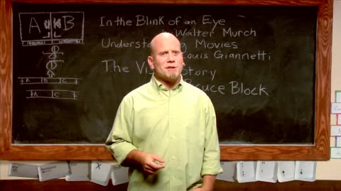
Several years ago Digital Juice produced several training series for the web called DJTV. It covered topics ranging from Audio, Tech Info, and Filmmaking Basics. One of the shows I enjoyed the most was "Cutting Class" by Chris Gates.

Cutting Class

More often than not, the edits in your sequences need to seamlessly flow, and not distract from the big picture. In this episode, Chris "Ace" Gates, looks at the decision making process and covers some basic training for camouflaging your cuts.

Topics range from Color Correction, Scene Transitions, ADR, Blending Modes,Tips for Text, Green Screen, and more! Chris "Ace" Gates shares some simple but effective editing tips and techniques for utilizing mattes and masks to build multi-layered composites.

Here is a link to watch all the Cutting Class videos, be sure to start with the first video on page 1, for some reason it has all the episodes listed with the last one first.

WATCH CUTTING CLASS

8:00AM

Learning the Basics - Pt. 2

Several years ago Digital Juice produced several training series for the web called DJTV. It covered topics ranging from Audio, Tech Info, and Filmmaking Basics. One of my favorite "shows" was Field of View, where they covered what I call "Film Theory." In FOV the main focus (no pun intended) was to discuss how to communicate your message to the right audience.

Field of View

Chuck Peters reflects on what makes a pro a pro and challenges producers to shift the focus of their minds to think less like technicians and more like artists and to invest in their talent, not just their equipment. 

Most of the emotion in your videos is generated with music and images. It's nonverbal. You can take your edits to a higher level of professionalism by letting your shots do the talking.

Here is a link to watch all the FOV videos, be sure to start with the first video on page 1, for some reason it has all the episodes listed with the last one first.

WATCH FIELD OF VIEW

10:00AM

iPads in Filmmaking

The Times also recently ran a profile of the iPad's growing popularity in Hollywood, noting that it's "the must-carry accessory on sound stages this season, visible behind the scenes of television and film shoots and in business meetings."

For example, Bob Orci, one of the writers working on the sequel to last year's blockbuster "Star Trek," kicked off a recent meeting with his co-writer and three producers by whipping out his iPad to show off movie stills, potential scene locations, and a photo of a prospective actress that he had edited on the tablet to sport a Vulcan ear.

“When you’re carrying a little TV around, you bring the power of imagery to places that you don’t normally have it,” Orci said.

The report also notes that Apple products have turned up about 2,438 times on television programs through this September, amounting to a wealth of free advertising for the Cupertino-based company, including recent iPad stints on “Modern Family,” “Fast Money," and “Fox & Friends.

At the same time, the Apple tablet is being put to work backstage, where actors and actresses using specially designed apps, like Rehearsal, are using it to help them learn their lines ahead of each shoot.
- - - - - -
Source Article

3:52PM

Film Editing 101: Eye-Blinks

"We’ve been going through my notes from my Editing 1 class that I took in Film School from Professor Gerstein.  Today, I’ll share an extremely practical tip about eye-blinks.

When someone’s eye blinks, the window to his soul is closed.  It distances you from the person.  Avoid closed eyes and lazy eyes on the cut.  It has a subconscious effect on the viewer.  Cutting on an eye blink is not wrong but it must only be used intentionally and carefully.

I make it a habit to go back through my edit when I’m finished with a scene and skip from cut to cut checking the actors’ eyes for blinks.

About a month ago, I went to see Scorsese’s Shutter Island.  This movie is full of “bad” cuts.  But they are in there on purpose.  If you’ve seen the movie, you know why.  The plot/story drove all the decisions – including the edits.  Like the movie or not, that’s pretty cool.  You gotta love Scorsese.  I’m looking forward to seeing the film again when it comes out on DVD so I can look at the cuts more closely – including the eye blinks." ~ by Jeremiah

- - - - -
Source Article